— PROJECT NAME
UI Design for Xerox
— ROLE
Designer, Animator
— DATE
2003
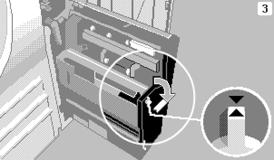
Icons and animations for Xerox’s touch-screen photocopier displays. These were for an all-new UI refresh of existing hardware, for which the monochrome LCD could only display 4 shades – white, light grey, dark grey and black. I used extensive dithering and ‘anti-aliasing’ pixels to give the impression of greater refinement (the icons are seen much larger here than on the actual display).
The frames of the jam-clearance animations used similar illustrative techniques in Photoshop, and were put together in Flash. Flash was also used internally to prototype interfaces.
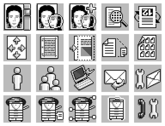
Touch-screen icons for a photocopier display
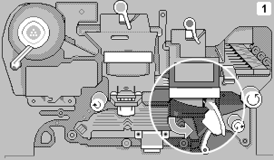
Frame from a jam-clearance animation
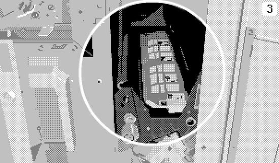
Frame from a jam-clearance animation
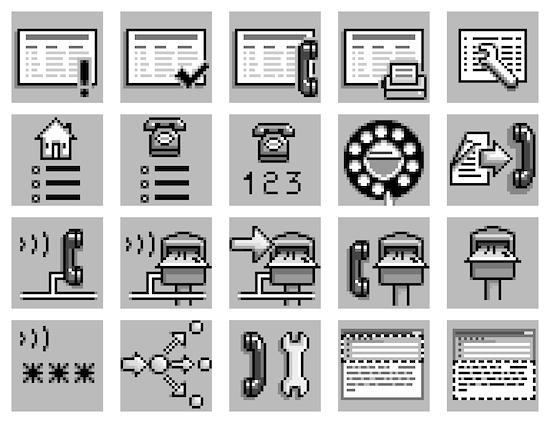
Touch-screen icons for a photocopier display
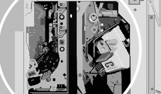
Frame from a jam-clearance animation
Frame from a jam-clearance animation
Jam-clearance animation. 4 shades.
Jam-clearance animation. 4 shades.